Simply Baby Clothing Company Logo Mark
Problem:
We can imagine was commissioned to create a new logo mark for the online child clothing store ‘Simply baby’. The company wanted to expand to other market areas with new products.
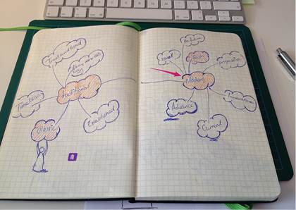
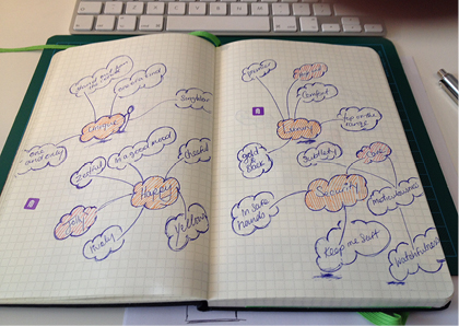
Research:
From the start it was agreed upon that something simple and easily recognisable was needed. The starting point for the project cantered around words that were associated with babies and young children. From this mood boards were formulated to visualise: style, colour and form.
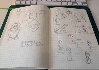
Solution:
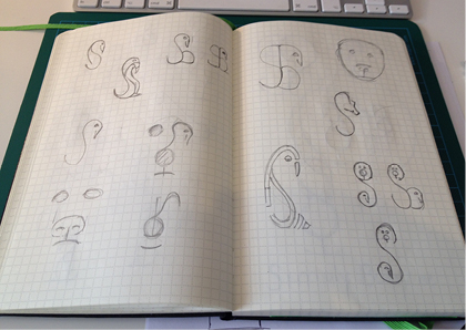
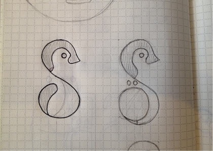
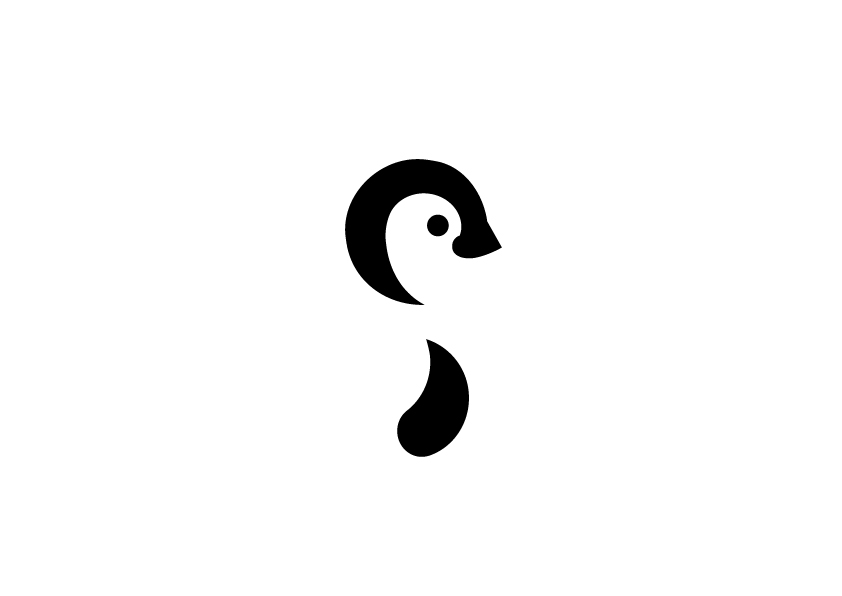
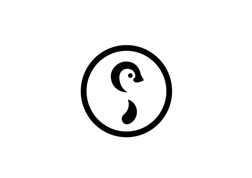
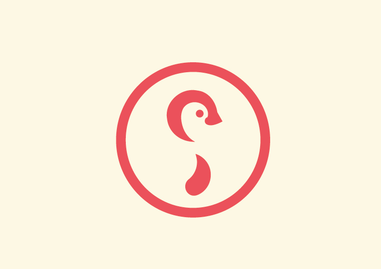
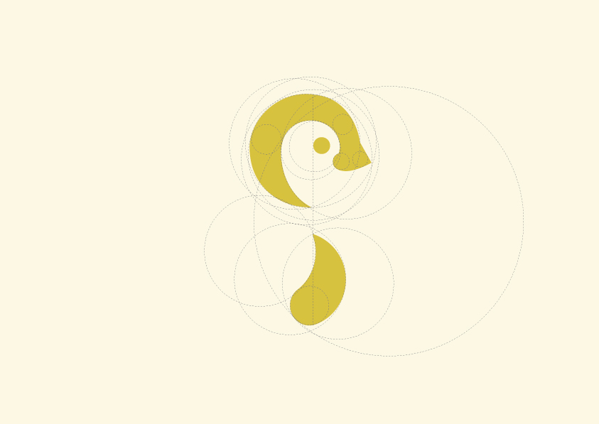
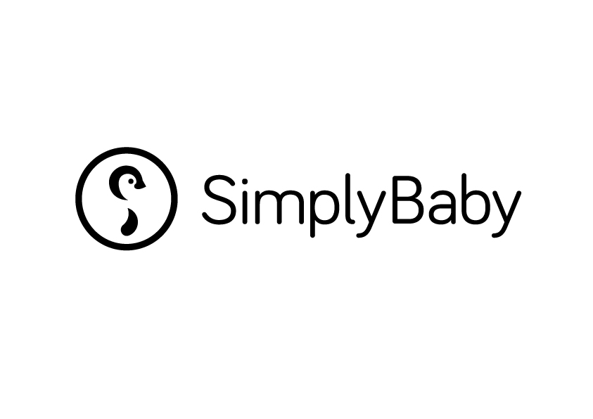
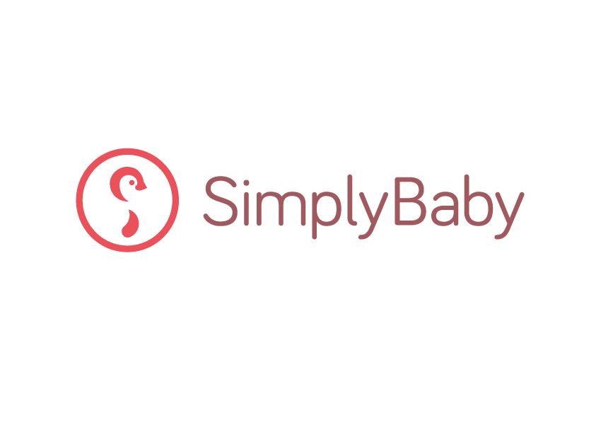
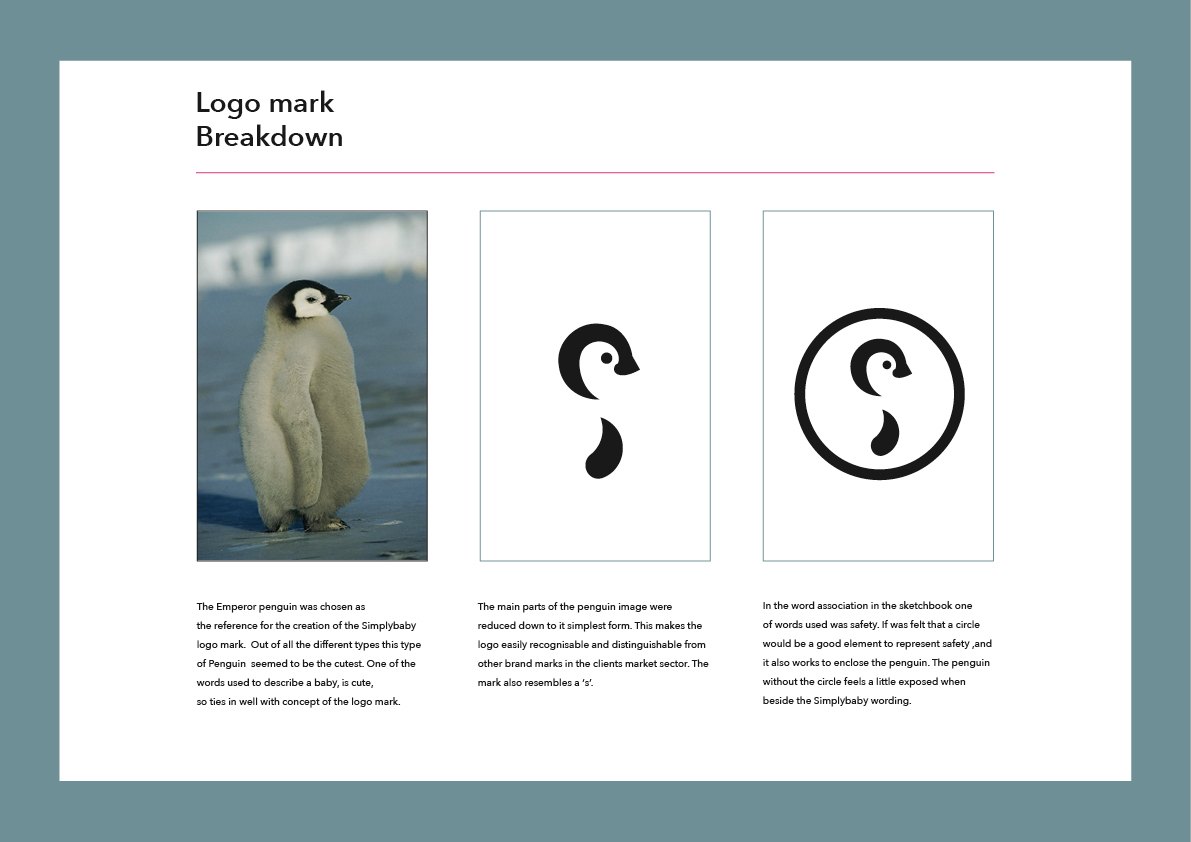
The client had two young children that have a fondness penguins and polar bears. This was a great angle to pursue and tied in well with the clients business. The final solution has a lovely simple feel to it, with the penguin mark resembling a ‘s’. In the sketching phase of the project the idea of using both the polar bear and penguin in the final mark was explored. After extensive exploration of the penguin and polar bear as one unit it was felt the penguin on it own would work best. An image of a baby penguin was used as a reference point to create the mark. The typeface chosen to accompany the mark was Bariol, designed by Spanish studio Atipo. Back to Portfolio page.